Infographic

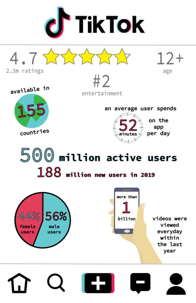
For my infographic I decided to do it on a fairly new app, TikTok. I researched the history of the creation of the app. I also looked into fun facts and statistics about the app. I used this information in my infographic. This project was really fun for me because I enjoyed doing it on an app I use and love. I got to be creative and make my own shapes and design on Illustrator. I found some images online but I mostly created all of the shapes on my infographic. It was definitely challenging at times but it was satisfying at the end to see what i accomplished.

Boxes

For this project I started with 49 blank boxes. One by one, I created unique shapes for each box using a lot of the tools in illustrator such as, the ellipse tool. It was difficult to come up with different ideas for each box. But after that, I began to fill each box with colors. I decided to make my boxes have a rainbow color scheme. Once I reflected my grid vertically, and then horizontally, I ended up with 196 boxes. The colors created a circular pattern from reflecting it. This project was a lot of fun and let me be creative since I had to make a lot of the artistic choices on my own.

Plagiarism

When you think of plagiarism, most people think of copying a source when writing an essay. However, there are many other ways in which people can plagiarize. In fact, it is very easy to accidentally plagiarize in graphic design. When referring to plagiarism in graphic design, it means “the unauthorized use or close imitation of existing artwork and the representation of it as one’s own original work”, which was stated in the ethics in graphic design. Plagiarism is an important concept, no matter what platform it occurs on. That is why it is very critical to be aware and know how to avoid this problem. When working on a project, it is crucial to know the images you are using are not copyright and you have the rights to use it. When in doubt if you are allowed to use an image, it is better to be safe than sorry and not use it.

Elephant

This project was so much fun! I loved learning how to color in the elephant and using different tools, like gradient. I also learned how to use the eyedropper tool in order to make my color swatches on the top. This was really cool to make and I am hoping to do similar projects like this in illustrator.

Pencil

Today in class we used illustrator for the first time. To get comfortable with this new application, we did a simple project where we created a pencil using basic shapes. I learned how to make each individual shape of the pencil, mostly using the rectangle tool. I filled the shapes with different colors. I also used a gradient tool on the metal part of the pencil. I also learned how to round the edges of the rectangles. This project was a lot of fun and helped me get to know the tools and tricks within illustrator.

Final Poster

For my final social awareness poster project I decided to draw attention to the excessive amount of plastic in the ocean. I got this idea by looking at similar posters on Pinterest. I started by finding the perfect underwater background. Since it wasn’t the right dimensions I had to use the clone and stamp tool in order to make the water look real and fill the dimensions. Next, I cut the image of the whale in half. I filled the other half of the whale with plastic to symbolize that a majority of the ocean is filled with plastic and it is harming our marine animals in their home environment. My poster is simple but brings the point across to “Skip the Plastic.” and protect our ocean and it’s creatures. Lastly, I added a logo of an organization whose goal is to protect the ocean. Finally, I uploaded my poster on my blog and submitted it. This project was really fun and let me be creative about a social problem that I am passionate about.

Enhancing Photos

Today in class I started with the image on the left. I then learned may ways in which I could repair and enhance this image. I started by using the quick selection tool to change the color of the wall. I then used the sponge tool to change the color of the window. I then used the dodge tool to make the flowers brighter. I then used the auto tone, contrast, and color for the best possible image. Lastly, I exported my final image so I could post it to my blog.

Enhancing Photos

Today in class I started with the image on the right. I used many tools to enhance and repair this image. I used the auto tone, contrast and color. Then I fixed the blotchy area in the top right corner by using the cloning tool. Lastly, to spice up the image I used the quick selection tool to select the man’s shoes and I increased the hue, saturation, and lightness to make his shoes fun and colorful. This sure does make the image pop! To finish, I saved my image for the web and uploaded it to my blog.

Non Destructive Selections

Today in class i practiced using non destructive selections. I started with this image of the donkey, and then I added the straw hat. I used the magic wand tool to select the hat and add a layer mask. Then I placed the hat on top of the donkey and used the brush tool to make it seem like the ears were popping through the straw hat. I really enjoyed this project and it helped me become more comfortable with the brush tool.

Design a site like this with WordPress.com
Get started